A New Look For So Much Life!
A fun little "glowup"
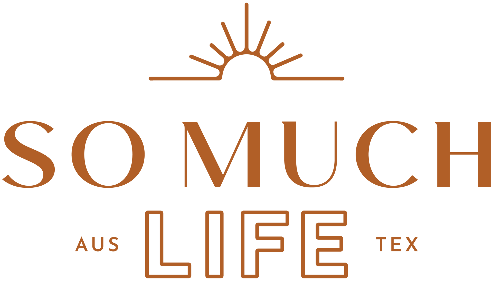
During my month away from blogging, So Much Life got a little facelift. There’s a lot of intention behind the new logo, and I had so much fun creating it.

Here’s a bit more about the branding and the process, if you’d like to see…

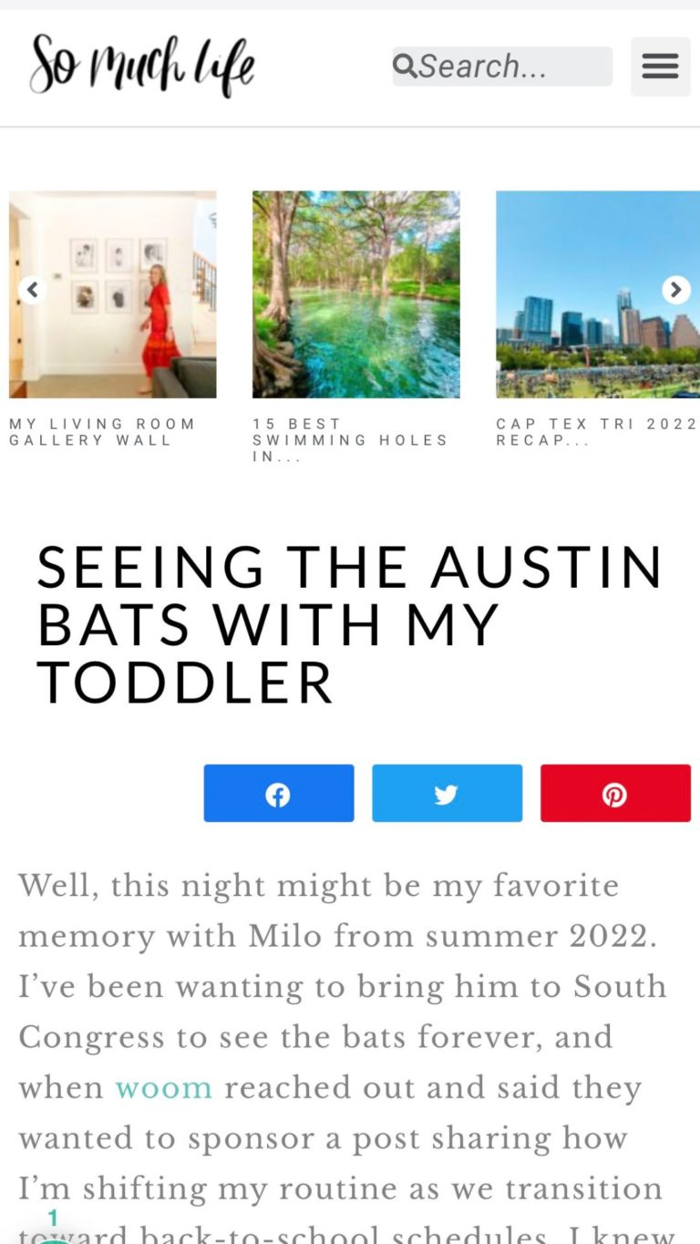
The old logo (pictured above) was cute, but I had used it for about 5 years and it was starting to feel dated and lackluster to me. It was great in my twenties (very whimsical and fun!) but I wanted a more chic, grown-up version as I bring this website with me into my thirties.
I worked with Debbie Trout at Trout Design Co. She did the branding for both The Austin Things and The San Antonio Things, and I had such a great experience working with her that I asked if she could squeeze in this lifestyle blog refresh during my month long break. I’m so thankful she was willing to take on the project.

About The Logo
I specifically wanted something that was a bit more chic and sophisticated this time around. But I didn’t want it to be too cold, so two other words that were important to this design were lively and inviting.
I sent my designer some mood inspo, some logos and color schemes I liked, and she created a discovery & mood board for the branding.

About The Sun Mark
After deciding on some key design elements and a general direction for the design, Debbie created a few initial concepts for me to review.
We decided to add in a custom sun mark. The sun typically symbolizes energy and life, so it felt fitting to add it into the So Much LIFE design.
I also love how the rising sun symbolizes fresh beginnings.
If you’ve been around here for more than a few months, you probably know how much I love fresh starts.
1. I am and always will be an early morning person.
2. Monday is my favorite day of the week. There’s nothing like starting a fresh work day on Monday morning with a hot cup of black coffee, a clean desk, and a big to-do list to tackle.
3. January 1 is full of so much amazing energy. I love New Years goals and resolutions. I always share 12 little monthly goals for the start of each year. It’s just such a fun day full of good vibes.
4. I get excited about the start of a school year (even though I’m not in school and my kids aren’t old enough for school yet, ha!)
5. Honestly, any “restart” like the start of a new month or even the beginning of a new hour of the day is refreshing. I love the energy of a new beginning.

The sun mark that you see above is also in the main website logo (scroll up to the very top of the website and you’ll see it in the header.) It’s also used in the footer (scroll to the very bottom) and I’ll probably put it a few other places on the site.

My goal was to create a cozy and comfortable “living room” where you can stop by any time and read, browse, binge, or quickly say hi.
Haha, and in doing that, I was amazed at how many choices there were in such a small and simple redesign! The entire process took about 4 weeks, but it easily could have taken twice as long if I let myself dilly dally on choosing fonts and colors.

How cute is this monogram? I love it so much.
So, as a reminder, here’s what the website looked like a few days ago:

And you can obviously poke around to see what it looks like now. I adopted an entirely new color scheme (“ocean earth tones” for the sophisticated, comfortable look I wanted for the site) and new type for, well…everything! I spent a full day on the back end of the website updating all the bits and pieces.

I hope you enjoy the new updated site!
And thank you, Debbie, for doing such a great job on the fresh new look!

Looks cute! I really love the colors you picked. Are you able to share what it costs to do something like this?
Thank you! I’m always really cautious about sharing prices because I want to respect that designers can change their prices whenever they see fit. I will say that I did a decent amount of research before hiring a designer, and most branding and visual update packages will not be lower than 4 figures. Hope that’s helpful!
New branding looks really nice!